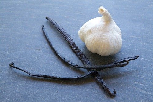
 Didn't recognize the place did ya'? Yeah, the blog has a brand-spanking new look. I think it fits me pretty well.
The old blog was like an old house, wonderful because it had so many memories and emotions attached to it. However, over time, you begin to notice little things. The paint is peeling, the floor creaks, the door jams, and dammit if that light doesn't always seem to go out. In this case broken links, light text on a dark background, and non-user friendly layout were hurting the blog. It had gone in its previous incarnation as far as it could.
It was time to renovate. Touch things up. Redecorate. Some new paint. New furnishings. Fancy side bars. Clear FAQ pages. This was sweeping under the rugs and getting out the useless buttons dirtying things up. It was hanging window treatments to advertise my twitter and myspace. This was Extreme Home Makeover - Blog Edition.
Still, it's a big change. Change is supposed to be a good thing, but I must admit I don't handle it well. This was a stressful process. One I have been putting off for sometime, as I've been hiding under the covers so it couldn't get me.
I have two people to thank for all their help in this. The first is Ellie Moore of Rainy Day Templates who worked with me, listened to me, gently helped me make good conclusions and sound decisions, and made this whole process extremely fun (and affordable). Ellie, you are amazing.
The second I have to thank Elise who did an amazing job taking and editing the banner picture. The old one was cobbled out of my poor Photoshop skills and pictures I lifted from the web when I first started blogging.
Anyways, I'll be still fixing a few things here and there over the next few days so if you see things missing or out of whack, please bear with me.
Thank you much!
XOXO
-Garrett


Oh i love your new home!!!!
ReplyDeleteI really like the new site design!
ReplyDeleteLove the new pad Garrett! Well done!
ReplyDeleteLooks great- congratulations!
ReplyDeleteGlad you chose to go with "change"! It's nice here!!
ReplyDeleteLooks great! There is indeed something about a new design that gets things bumpin' in a whole new way. Hooray!
ReplyDeleteReally nice job designing a blog that seems to capture the essence of you (or I guess what I think you are, since I don't really know you!) Love it.
ReplyDeleteThanks so much, Garrett! You were a breeze to work with, hesitation and all. Thanks for being so available and enthusiastic, and having such smashing good taste to begin with.
ReplyDeleteCertainly makes my job much easier. =)
Love it.
ReplyDeleteSaw something you might be interested in when reading on the AP wire recently:
http://m.apnews.com/ap/db_8560/contentdetail.htm?contentguid=2hQDLmcq
I want to find this cookbook and buy it!
Great blog - keep it up!
Very swanky. And I know how you feel. I went from a very deep quiet chocolate coloured blog to bright pink and purple (well, bright for me, I tend to keep my colours pretty neutral) and cupcake polka dots. It took some getting use to, but it feels like home now
ReplyDeleteit looks lovely! one small complaint, and this is just me being a total cupcake whore - i shall miss the cupcake dropdown menu.
ReplyDeletelove the new look.
ReplyDeleteGorgeous renovation!
ReplyDeleteYour new "place" is terrific!
ReplyDeleteGarrett-
ReplyDeleteCongratulations! Love the new look!
I like the new design, but I miss the cupcake drop down. How do I find the cupckakes on your site?
ReplyDeleteAnnonymous: The old cupcake dropdown didn't fit. I'm working on a solution. At the moment, use the search function. =)
ReplyDeleteHi - love the new look! clean and sophisticated. :)
ReplyDeleteGreat new digs! I think it fits you well.
ReplyDeletei dig. looks great, it's very fresh and renewing!
ReplyDeleteLovely! Very Classy. Without a K.
ReplyDeleteBravo!
ReplyDeleteLove your home makeover, blog edition ;)
ReplyDeleteLooks great Garrett!
ReplyDeleteLooks awesome.
ReplyDeleteNot that I ever noticed all that peeling paint and old furniture that you mentioned, but still...
Wow, it's gorgeous! Congratulations Garrett, it's beautiful.
ReplyDeleteVeddy nice look, indeed. But as a fellow English major, I feel I must tap your shoulder about the typos I found: 1) the last sentence of the 1st paragraph in the About section needs a capital 2) "repertoire" in FAQ #1 3) "guarantee" in FAQ #3
ReplyDeleteI just want your blog to be as sleek and perfect as possible <:}
Looks great!
ReplyDeletelovely. well done on the update in style, love the blues.
ReplyDeleteShibby!!!
ReplyDeleteThanks for making it easier to read with the text color and backround changes.
Mee too with the missing of the cupcake drop-down, but I suppose I won't die of using the search function.
The new site is beeyooteeful and classy, Garrett! I second the cupcake menu, but 'tis a small quibble. Blog still rawks.
ReplyDelete-- @missTdJ
Love the new design!
ReplyDeleteLove it!!! :) Kudos!
ReplyDeleteSo beautiful! Really love it.
ReplyDeleteCongrats, Garrett! Looks brighter and cleaner. Money well-spent.
ReplyDeleteGarrett, it looks good! I've been visiting your blog for a while but this is my first post. Keep writing! Your blog is fun and insightful. :)
ReplyDeleteIt looks good! Welcome to your new digs, I feel I ought to get you a housewarming gift or something. Want some blueberries?
ReplyDeleteSo pretty! So much easier to read!!
ReplyDeleteIt's funny. I just stopped by for the first time in a long time a few days ago and everything was the way I remembered it. Today, all shiny and new. I love it. Congratulations on your new look... and viva la eat beast!!
ReplyDelete